If your website is getting traffic but not converting visitors into leads or customers, the problem usually isn’t your marketing—it’s your website itself.
A lot of business owners invest in ads, SEO, and social media, but overlook the small (yet critical) issues on their site that quietly push users away. The result? Lost trust, high bounce rates, and missed revenue.
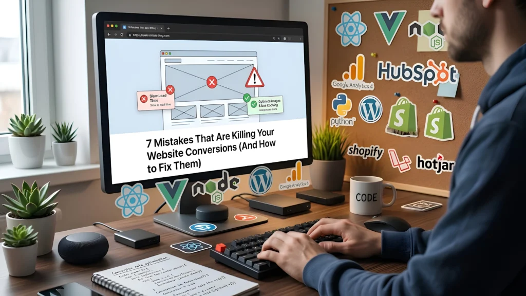
Let’s break down the most common mistakes that hurt conversions—and more importantly, how to fix them.
1. Slow Loading Speed
The Problem
People are impatient online. If your website takes more than a few seconds to load, most users will leave before even seeing your content. It doesn’t matter how good your design or offer is—if it’s slow, it’s losing you money.
How to Fix It
- Compress images without sacrificing quality
- Use a fast and reliable hosting provider
- Minimize unnecessary plugins and scripts
- Enable caching and use a CDN
Quick Insight
Even a 1-second delay can significantly reduce conversions. Speed isn’t just technical—it directly impacts your business.
2. Poor Mobile Responsiveness
The Problem
More than half of your visitors are likely coming from mobile devices. If your website looks broken, cluttered, or hard to use on a phone, users won’t stay.
Common issues include:
- Text too small to read
- Buttons too close together
- Layouts breaking on smaller screens
How to Fix It
- Use a responsive design that adapts to all screen sizes
- Test your site on multiple devices
- Keep layouts clean and touch-friendly
- Prioritize mobile-first design thinking
Quick Insight
A mobile-unfriendly website doesn’t just hurt conversions—it also affects your SEO rankings.
3. Confusing or Poor UI/UX
The Problem
If users don’t understand what your website is about within a few seconds, they leave. If they can’t find what they’re looking for easily, they leave faster.
Bad UI/UX includes:
- Cluttered layouts
- Too many distractions
- No clear structure or flow
How to Fix It
- Keep your design clean and minimal
- Use clear headings and sections
- Guide users with a logical flow (Home → Service → Contact)
- Focus on clarity over creativity
Quick Insight
Good design isn’t about looking fancy—it’s about making things easy to understand and act on.
4. Weak or Missing Call-to-Actions (CTAs)
The Problem
Your website might be informative, but if you’re not clearly telling users what to do next, they won’t take action.
Examples of weak CTAs:
- “Learn More” (too vague)
- No visible contact buttons
- CTAs hidden below the fold
How to Fix It
- Use clear, action-driven CTAs like:
- “Get a Free Quote”
- “Book a Call”
- “Start Your Project”
- Place CTAs strategically across the page
- Make them visually stand out
Quick Insight
Every page on your website should have one clear goal—and a CTA that supports it.
5. Lack of Trust Signals
The Problem
Visitors don’t know you. If your website doesn’t build trust quickly, they won’t take the risk of contacting you or making a purchase.
Missing trust signals include:
- No client testimonials
- No portfolio or past work
- No contact details or business information
How to Fix It
- Add real client testimonials (with names or photos if possible)
- Showcase your previous work or case studies
- Display contact details clearly
- Include badges, certifications, or guarantees if applicable
Quick Insight
Trust is the foundation of conversions. Without it, even the best offer won’t work.
6. Too Much Information (Overload)
The Problem
Trying to say everything at once often results in saying nothing clearly. When users are overwhelmed with text, visuals, or options, they stop engaging.
How to Fix It
- Break content into sections
- Use bullet points and short paragraphs
- Focus on one message per section
- Remove anything that doesn’t support your main goal
Quick Insight
Clarity beats quantity. A simple message converts better than a complicated one.
7. No Clear Value Proposition
The Problem
Why should someone choose you over others? If your website doesn’t answer this immediately, users won’t stick around to figure it out.
How to Fix It
- Clearly state what you do and who it’s for
- Highlight your unique advantage
- Focus on benefits, not just features
For example:
Instead of saying “We build websites”, say
“We build fast, high-converting websites that help you get more leads and sales.”
Quick Insight
Your value proposition should be visible within the first few seconds of landing on your site.
Final Thoughts
Most websites don’t fail because of one big issue—they fail because of multiple small problems working together.
The good news? Every issue listed above is fixable.
If your website isn’t generating leads or sales, it’s worth taking a step back and evaluating these areas carefully. Small improvements in speed, design, clarity, and trust can lead to massive improvements in conversions.
Need Help Fixing Your Website?
If you’re not sure where your website is going wrong, or you don’t have the time to fix everything yourself, that’s where we come in.
We specialize in:
- Shopify store development
- WordPress website design
- Custom high-performance websites
From improving speed to redesigning your entire user experience, we help turn underperforming websites into conversion-focused assets.
Let’s fix what’s holding your website back.

